Logos are the visual embodiment of brands. They should stand out from competition, yet make sense for the industry. We have studied color psychology and typography, and understand how these things impact our subconscious.
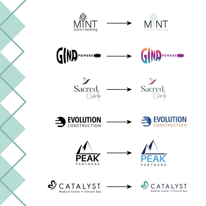
This is why we present logo options to our clients in black and white first. We don’t want colors to influence your final decision.
We want you to choose your logo for its design.
There will always be a scenario when your logo will be used in black and white, and we want you to love it as such. Think of the colors as the sprinkles on top!
We even listen to specific playlists when curating a logo, just to place ourselves in the right creative atmosphere for your brand’s vibe! We take pride in knowing that each and every one of our designs has, at its core, a meaningful story.


