Designing for the Tradeshow Floor:Tips from a Graphic Designer
We sat down with our Graphic Artist, Erin, to get her take on what it really takes to design for the tradeshow floor. Tradeshows are one of the most unique design challenges out there. Unlike a social media post or a website, you’re designing for a space where people are moving fast, distractions are everywhere, and you have just a few seconds to make an impression. Here’s how Erin approaches tradeshow design and what she’s learned along the way.
Think Billboard, Not Brochure
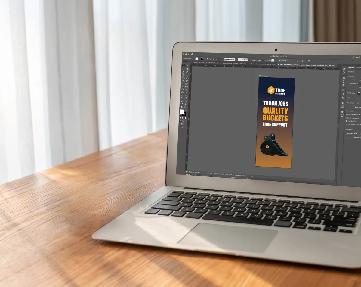
When designing for a tradeshow environment, Erin always keeps one thing in mind: this is essentially a billboard. People are walking by quickly, so your booth needs to catch their eye immediately. That means keeping your large-format pieces like banners, backdrops, and signage focused on brand recognition and general awareness. Save the detailed information for flyers, handouts, and brochures that people can take with them and read at their own pace.
Design for Distance and Movement
Visibility is everything on a tradeshow floor. Erin relies heavily on contrast, a clear hierarchy between large and small text, and strong headlines that pull people in. Photography matters too. Choose images that are bold and attention-grabbing rather than decorative. The biggest trap is clutter. When a design has too much going on, it becomes overwhelming, and people will walk right past your booth without a second glance.
Keep It Cohesive Across Every Piece
A tradeshow presence usually means designing across multiple materials at once, including banners, table covers, handouts, and signage. The key is making sure everything is focused on the same message and has the same visual look. If your banner has a navy background, carry that through every piece. Use consistent photography and color choices throughout. Erin’s approach is to start with one anchor piece and then build everything else from that foundation.
Less Copy, More Impact
One of the most common mistakes Erin sees is brands trying to put too much information on their large-format materials. It’s not digestible for someone walking by. A better approach is to let the visuals do the heavy lifting on banners and backdrops, and direct people to a flyer, a QR code, or an actual conversation with someone at the booth. You don’t need to say everything on the banner. That’s what your team is there for.
It’s also important to stick to your brand guidelines and limit yourself to two to three colors in a design. When every brand color shows up on every piece, it becomes chaotic. Restraint is a design skill.
The Technical Stuff Matters More Than You Think
For large-format printing, image resolution is non-negotiable. Always use high-resolution photos. Low-res images that look fine on a screen will print blurry and pixelated at scale, and there’s no fixing it once it’s on a 6-foot banner. High-res files print clean and crisp, and it makes a huge difference in the final product.
A Project Erin is Really Proud Of
One of Erin’s favorite tradeshow projects was a banner she designed for an equipment company. Instead of listing out bullet points of product benefits, the team took a photo of the actual machine and used callout lines pointing to specific parts, with a close-up photo of each feature alongside the callout. So if one benefit was about the gear shift, you’d see the callout label and a close-up image of that shifter right next to it. It made the information visual and easy to understand at a glance. That project really reinforced how much more effective visuals are than text-heavy layouts when you’re trying to communicate on the tradeshow floor.
Looking to elevate your tradeshow materials? MINT can help you design a booth presence that stands out, from large-format banners to cohesive print collateral.