Fonts Tell Your Brand’s Story
Fonts aren’t just letters on a page, they carry personality. The right pairing can instantly communicate the kind of business you are.
For example, an equipment company might use bold, heavy fonts that project strength. A spa might use softer fonts that suggest calm and care. The pairing sets the tone for the brand before the message itself is even read.
First Impressions Matter
The fonts you choose can make your brand appear credible and trustworthy, or the opposite. Poorly paired fonts may give off a sloppy or unprofessional vibe, leaving potential customers second-guessing whether they want to work with you.
In short: your font choices speak for your brand, even if you don’t realize it.
Readability and User Experience
Font pairings also directly impact readability. A thoughtful combination highlights the most important parts of your message and makes your content easier to digest.
Think of a billboard: if the headline is too thin or overly decorative, it may be unreadable as drivers pass by. Bold, clean fonts help the message stand out, while supporting text can use lighter, simpler styles for balance.
Common Mistakes with Font Pairings
Here are some pairings to avoid:
- Using too many fonts – Stick to two, or three at most. Anything more becomes cluttered and confusing.
- Mixing weights poorly – Font weight (how thick or thin text appears) needs balance. Too many variations create clutter, while too little makes designs fall flat.
- Overusing script fonts – Scripts are best for emphasis, not entire sentences or paragraphs.
How Many Fonts Should You Use?
As a rule of thumb:
- Social media or digital content: no more than two fonts
- Print materials: two to three fonts can work, depending on the layout
This keeps your brand consistent and professional.
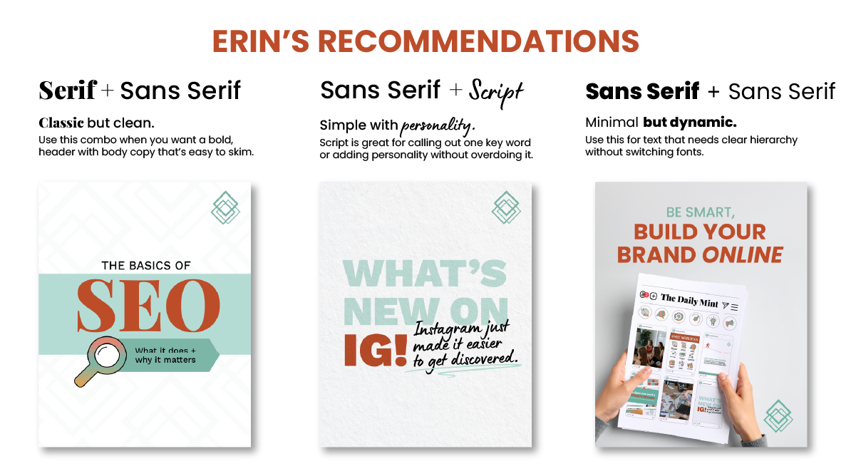
Favorite Pairings
Erin’s go-to? Pairing two clean sans-serif fonts. This creates a minimal, modern, and easy-to-read look that still feels dynamic. Scripts or serif fonts can then be sprinkled in for emphasis on a single word or short phrase.
Digital vs. Print Considerations
Not all fonts translate equally well across mediums. On websites, for example, certain fonts may not be available on every platform, so substitutions are sometimes necessary. In these cases, always prioritize legibility, avoid long paragraphs in decorative fonts and keep body copy simple and minimal.
How We Help
At MINT, we simplify font pairings for our clients by carefully selecting combinations that both complement each other and align with the brand’s identity.
We avoid overused fonts and instead focus on pairings that feel unique, professional, and true to the company’s voice. We’ll choose the right fonts to set the tone for your brand and make sure your message comes across the way you intend.